Image & Design
Logo Rank
The same synthetic logo scored 94 in teal and 66 in pale grey. Our Logo Rank test shows why its legibility and uniqueness scores need human interpretation.
Research summary
The same synthetic logo scored 94 in teal and 66 in pale grey. Our Logo Rank test shows why its legibility and uniqueness scores need human interpretation.
Logo Rank changed its overall score from 94 to 66 when we changed only the colour of a simple test symbol from teal to very pale grey. Its legibility score stayed at 100 in both cases. That combination makes the tool more useful as a prompt for design discussion than as a final pass/fail judgement.
Our controlled upload test
Tested on 16 November 2026 by AI Product Reviews automated browser test. This is a limited hands-on automated check of the public, free browser interface without signing in. The interface did not expose an exact software or model version. It is not a long-term human review or an independent accuracy benchmark.
We opened Brandmark’s Logo Rank and uploaded two original 512-by-512 RGB PNG images. Both had a white background, a filled circle and a white plus cut through its centre. The geometry was identical. The first circle was teal (#146b60); the second was pale grey (#f2f2f2).
These synthetic shapes let us change one variable without uploading a client’s logo. They do not represent a complete brand identity, wordmark or recommended logo design. You can inspect the teal input and pale-grey input yourself.


Scores returned
For the teal input, Logo Rank displayed uniqueness 91, legibility 100, colour/contrast 92 and overall 94. It reported zero very similar icons. Reuploading the teal input after the comparison returned the same scores in this session.
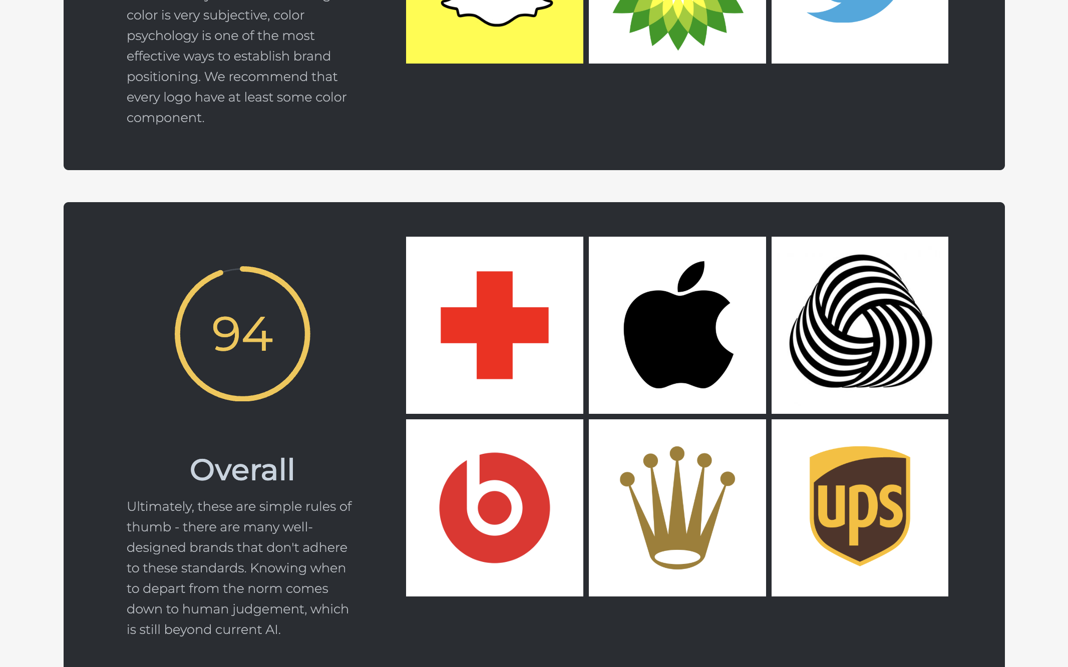
For the pale-grey input, uniqueness was 99, legibility 100 and overall 66. The colour/contrast gauge showed no numeric value and an empty arc. We have recorded that as an undisplayed value, rather than inventing a zero. Again, the interface reported zero very similar icons.
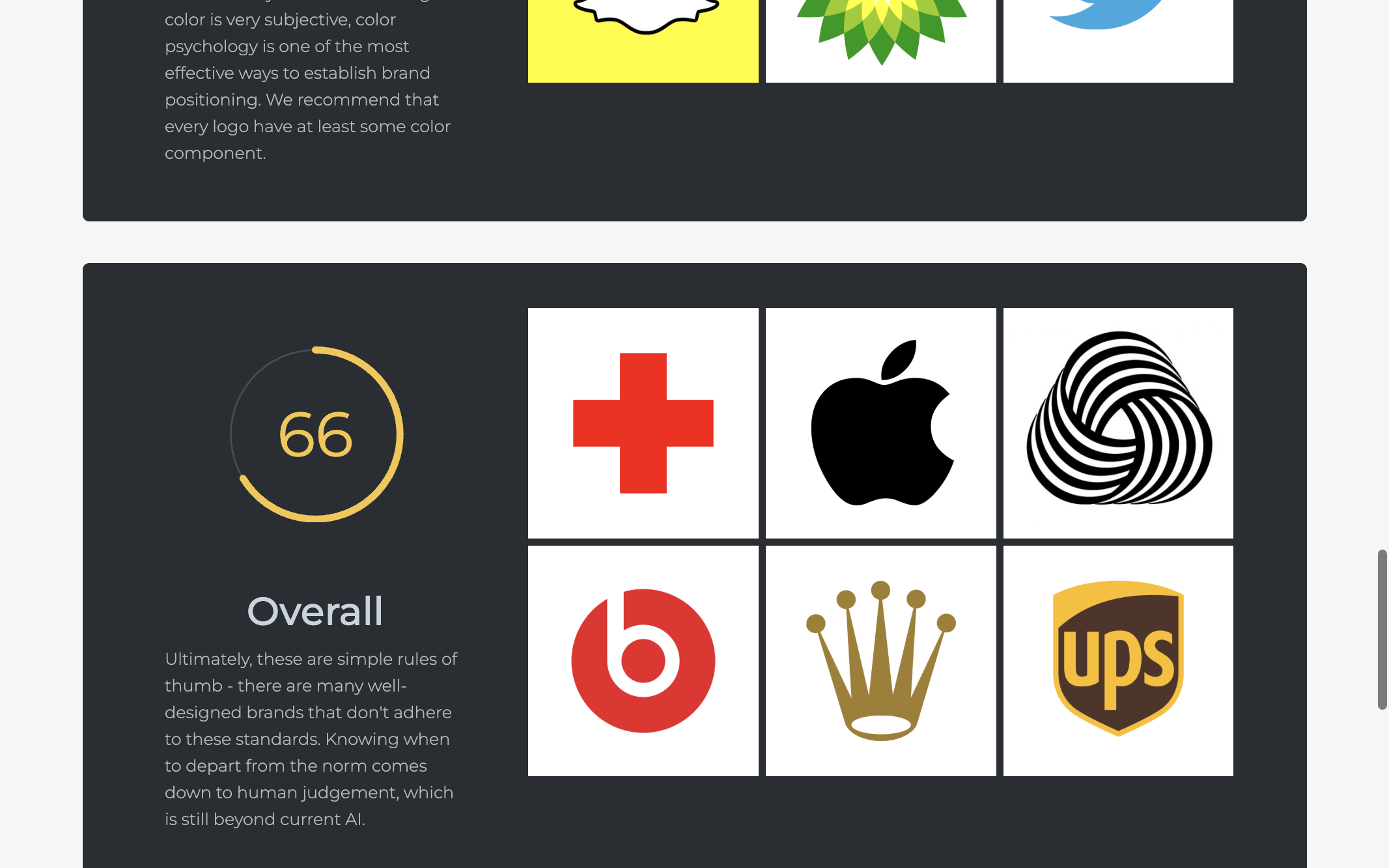
The lower overall score responded to the colour change. However, the unchanged legibility score did not distinguish our faint symbol from the more visible teal version. Uniqueness also rose from 91 to 99 even though the geometry was unchanged. A high uniqueness number therefore should not be interpreted as proof of a newly original shape.
Where human review still matters
The tool’s own overall section describes its measures as rules of thumb and points back to human judgement. Our two uploads reinforce that limitation. We did not test tiny rendered sizes, printing, embroidery, dark backgrounds, colour vision differences or actual audience recognition. We did not assess a finished identity system or compare Logo Rank against another scoring service.
Likewise, “zero similar icons” describes what this interface returned. It does not establish that no similar mark exists elsewhere or that a mark is available for use. There was no trademark clearance exercise in this test.
A practical use is to compare variants, note which numbers move, then inspect the artwork at the sizes and backgrounds where it will actually appear. Our test shows why the individual measures deserve attention: an overall change can conceal a legibility subscore that stayed constant. Do not optimise a logo solely to maximise the number.
Download the upload parameters and exact result record.